
In the course of its 75-year life, ASF has changed its name, appearance and format many times in its evolution from a pre-war pulp to the sharp-looking, modern magazine we see today. In the table below, I have charted this evolution through the title bars of the magazine. The table is in chronological order, but the examples shown and the dates given are not always the first occasion on which the change appeared, either because I did not have a good enough scan of the issue in question or the colour scheme does not highlight the change very well.
|
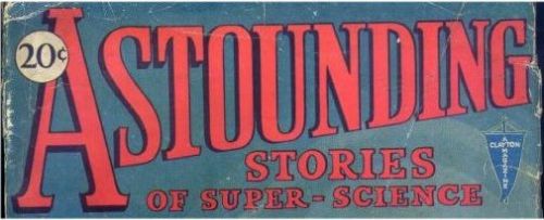
February 1930 - "Astounding Stories of Super Science" showing the blue Clayton banner at right. |
|
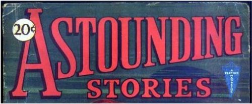
February 1931 - "Super Science" gets dropped |
|
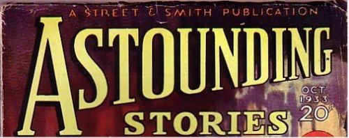
October 1933 - Street & Smith take over but the title remains the same. |
|
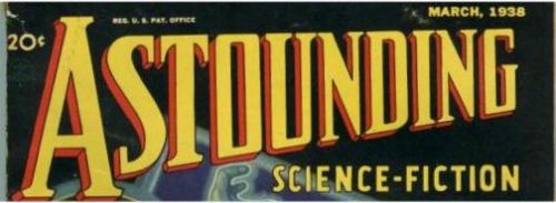
March 1938 - a change of title, now "Astounding Science-Fiction" |
|
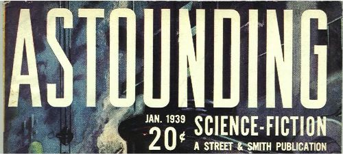
January 1939 - a new and more sober typeface |
|
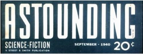
September 1940 - a subtle change, a new, more rounded look |
|
October 1942 - An elaborate new script and more prominence for "Science-Fiction" |
|
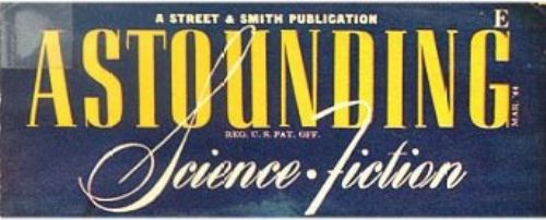
March 1944 - another new but somewhat more traditional typeface |
|
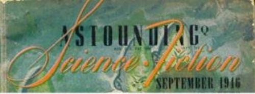
September 1946 - "Astounding" seems to be shrinking while" Science Fiction" is growing |
|
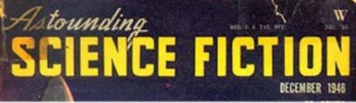
December 1946 - "Astounding" has almost disappeared while "Science Fiction" has lost its hyphen |
|
February 1953 - "Astounding" trying to make a come-back |
|
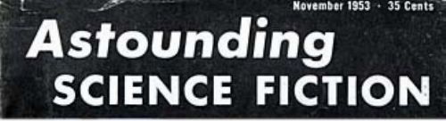
November 1953 - and now restored to full equality |
|
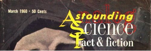
March 1960 (it first appeared the month before) - a shadowy "Analog" appears behind "Astounding" and now we have Fact as well as Fiction |
|
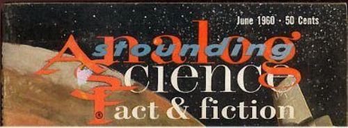
June 1960 - "Analog" is becoming more conspicuous as "Astounding" shrinks into the background |
|
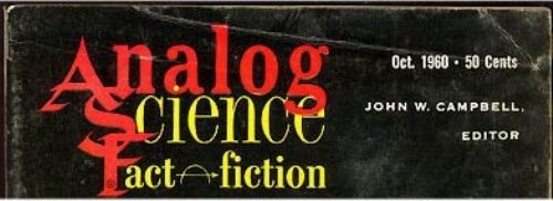
December 1960 - the transformation is complete. Note the arrow and semi-circle symbol, invented by Campbell and supposed to mean "analogous to" - though quite what he meant by "fact analagous to fiction" is lost in the mists of time |
|
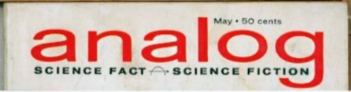
May 1962 - an entirely new image for the magazine, "Analog" in a trendy new typeface (and trendily shorn of its capital letter) on a white bar across the top of the cover. This form, or different coloured versions of it, ran to the end of the 1963-5 experiment with the large slick format |
|
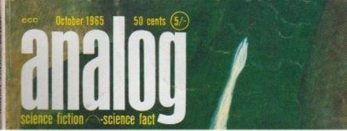
October 1965 - now back in digest format, the title is pushed to the left hand side in another new typeface, bolder and more condensed than before. "Science Fiction" now comes before "Science Fact", where it remains to this day |
|
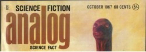
October 1967 - one of many variations on the same theme, "Science Fiction" at the top |
| November 1977 - Analog is afflicted with the Curse of the Bar Code, a hideous blemish that now mars the front covers of nearly all magazines. Why didn't they put it on the back? | |
|
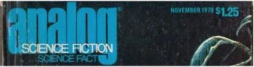
November 1979 - a minor variation on the same basic digest layout, "Science Fiction" overprinted in white on the main title |
|
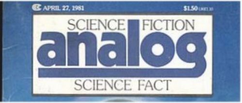
27th April 1981 - the first major change in appearance for sixteen years |
|
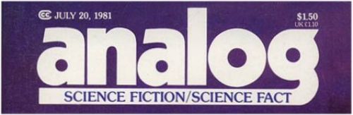
20th July 1981 - one of several minor tinkerings with the new layout |
|
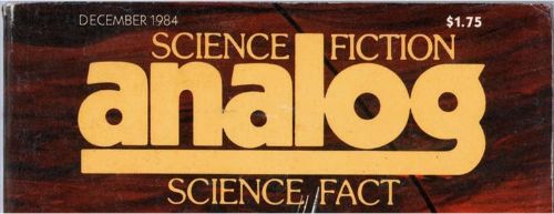
December 1984 - until they settled on this one |
|
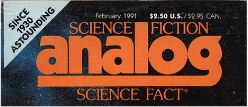
February 1991 - after 30 years of silence, "Analog" acknowledges its origins in "Astounding" |
|
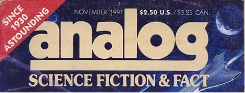
November 1991 - another variation in both layout and title - now it's "Science Fiction & Fact" |
|
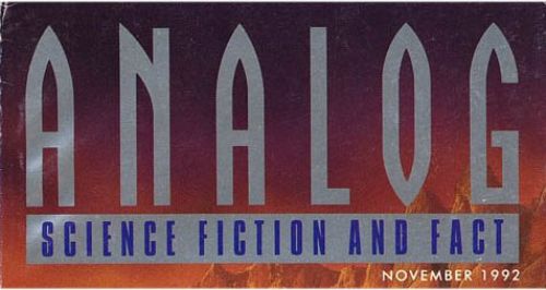
November 1992 - after eleven years, a new Gothic look and capitals are back in fashion |
|
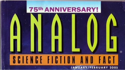
January/February 2005 - and so it has remained until the present day |